Supplements / e-commerce catalog · Website / Catalog / Lead Capture
NutriForge Supplements Website
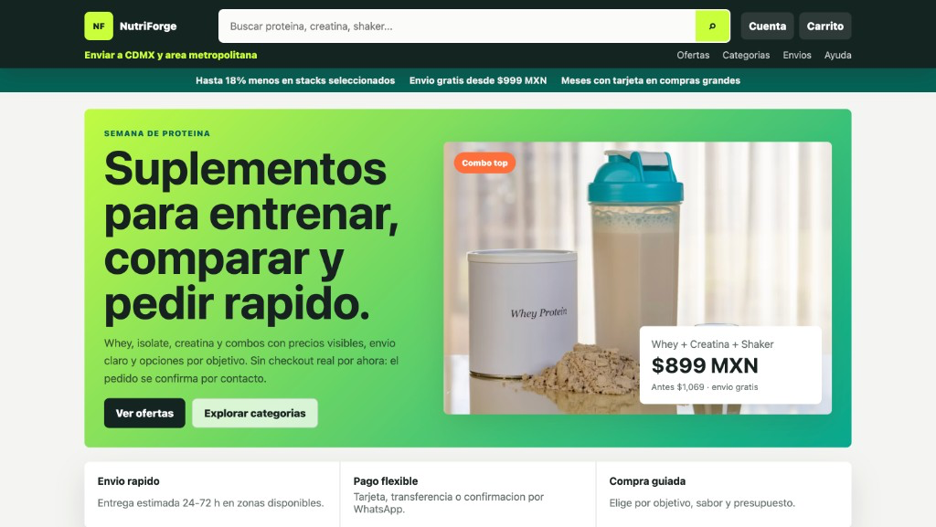
A mobile-friendly supplements catalog site for browsing offers, comparing products, and confirming orders by contact — without a full checkout backend yet.
Public website example shown with permission. No live checkout in this version — orders confirm by contact.
Overview
A mobile-friendly supplements catalog site for browsing offers, comparing products, and confirming orders by contact — without a full checkout backend yet.
Business context
A supplements brand needed a fast public storefront to present protein, creatine, and combo offers while orders were still confirmed manually by contact.
Problem
The business needed a clear catalog and offer experience before investing in full payment checkout infrastructure.
Constraints
- Spanish-language storefront for CDMX delivery messaging
- Catalog, search, and offer presentation without inventing live payment processing
- Orders confirmed by contact while checkout remains deferred
Solution
Built a responsive catalog website with hero offers, product cards, search, and guided browsing — with explicit contact-based order confirmation instead of a fake checkout.
Before / after workflow
Before
The brand needed a storefront to present products and offers before full payment infrastructure was ready.
After
Visitors can browse catalog, offers, and product cards on desktop and mobile, then confirm orders through contact.
Modules
- Hero offers
- Product catalog
- Search
- Mobile product cards
- Contact-based order confirmation
Key features
- Product catalog and search
- Offer and combo presentation
- Mobile product cards
- Category and shipping messaging
- Contact-based order confirmation
- Responsive storefront layout
Architecture or workflow
Marketing/catalog storefront → product and offer pages → contact-based order confirmation (checkout deferred).
Technology
VEP responsibilities
- Information architecture for catalog and offers
- Desktop and mobile storefront UI
- Honest contact-confirmation path (no fake checkout)
- Pricing and shipping messaging structure
Result
- Gave visitors a clear way to browse products and offers on desktop and mobile.
- Separated catalog experience from payment infrastructure so the first version could launch sooner.
- Kept order confirmation honest: contact-based until real checkout is ready.
What was learned
- Catalog-first storefronts can launch before payment rails if the contact path is explicit.
- Mobile product cards need price, shipping, and action hierarchy in one glance.
Next possible phase
- Real checkout and payment integration
- Inventory sync
- Abandoned-cart follow-up
Need a website that captures inquiries?
Start with a discounted Launch Website — fixed scope, mobile layout, and a clear contact path.